Sprint Drive: Website | App Store | Google Play | Prototype
Harman Spark: Website | App Store | Google Play
Intro
HARMAN Ignite connected car platform is a client-service based mobile app, a website and a special device - dongle, that plugs into the vehicle’s ODBII port, and reads all the vehicle’s telematics data, various values like fuel level, oil temperature and others, the device has also build-in GPS, G-force sensor, and a Wi-Fi hotspot.
I was leading the redesign of the Sprint Drive mobile app and web app, updating and enhancing existing features, and adding new features, based on driver needs and business needs, and creating a comprehensive system design for the whole white-label HARMAN Ignite platform.
As a few examples of HARMAN Ignite connected car platform I would like to show Sprint Drive and AT&T HARMAN Spark mobile apps.
There are more HARMAN Ignite connected car platforms tailored to specific mobile OEMs and automotive OEMS in North America, Europe and Asia markets, for example mobile apps for Audi and Nissan.
The main goal of this project was to design a scalable and flexible connected car platform, build a design system, update the look and feel of the legacy app, and introduce new features.

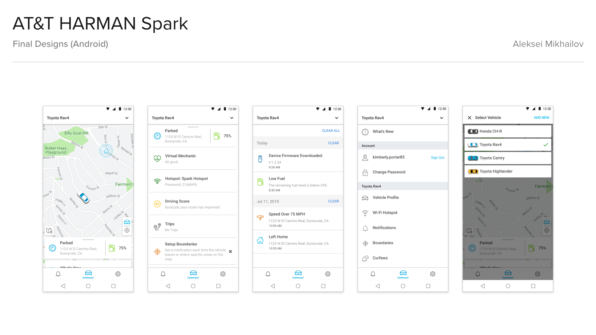

Final Designs (Mobile)


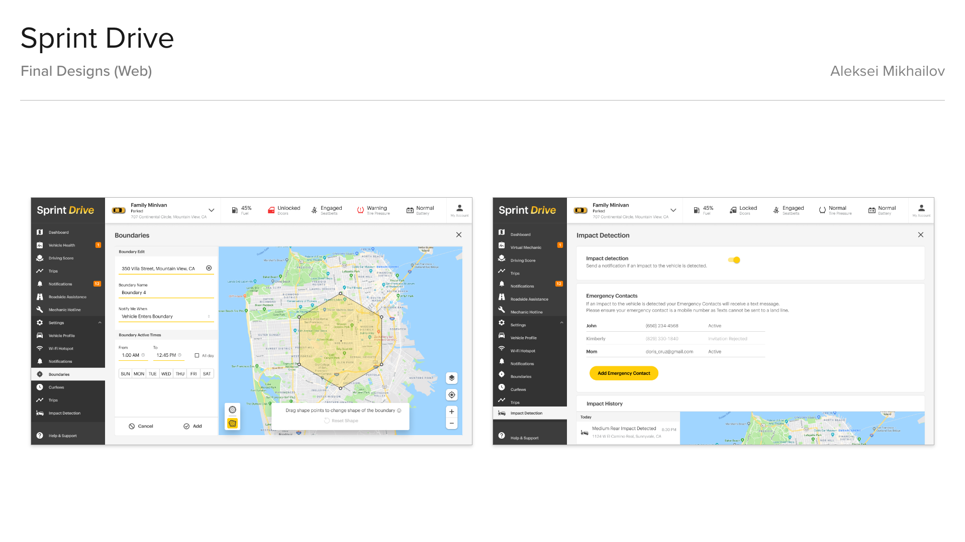
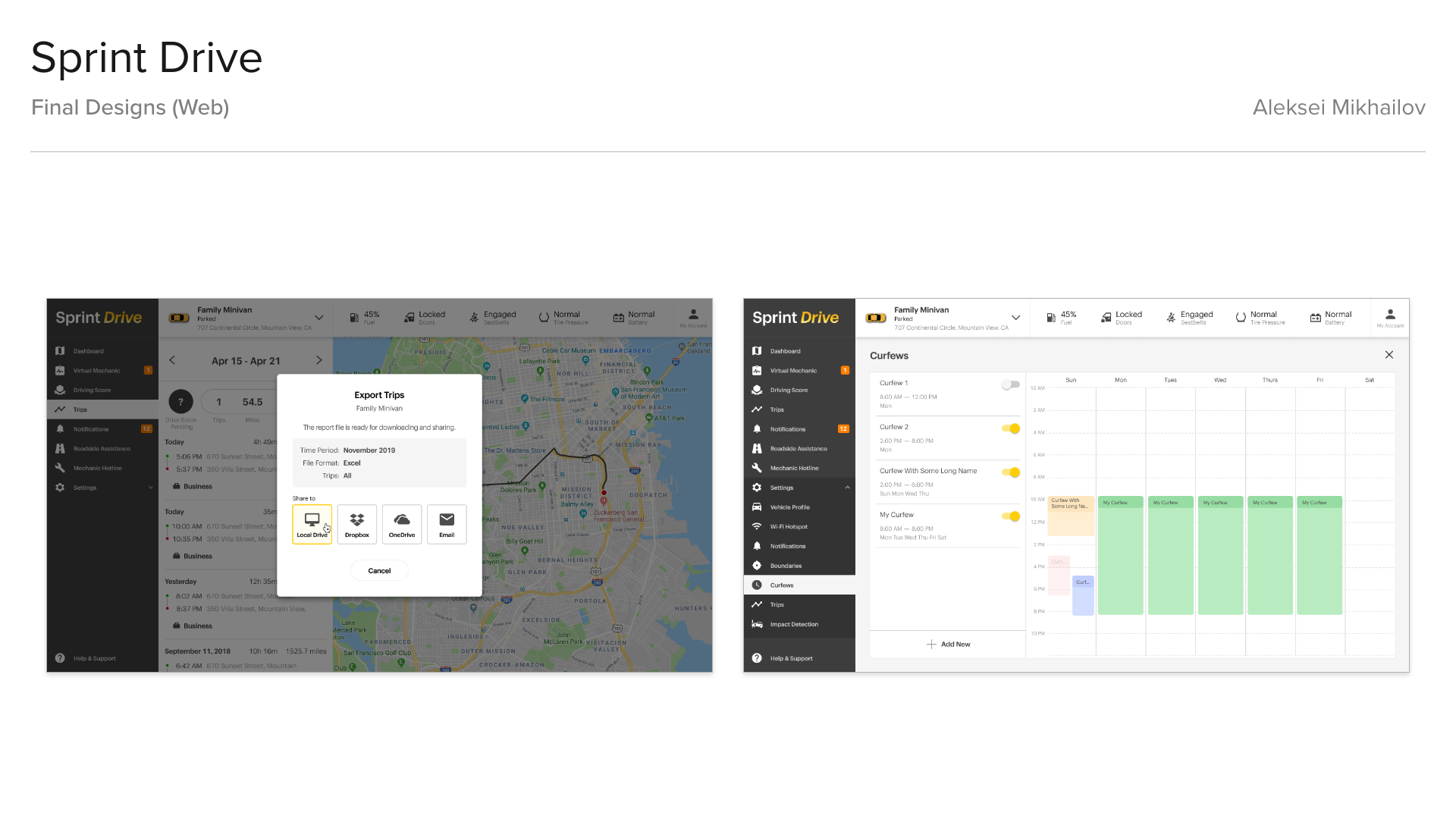
Final Designs (Web)
Process
I’ve started my design process with research and evaluation of the existing app, to pin down all UX flaws and possible user pain-points.
The customer also provided extensive user feedback data that helped in my research.
Among the main issues were:
• Overcomplicated in-app navigation, frequently used features were hidden.
• Busy, unintuitive screens, overloaded with information.
• Users could select the vehicle only from the main screen.
• Users were having issues with adding new vehicles.
• App design did not allow to add more new features.
• App design did not allow for 3rd party integrations.
• App design did not allow targeted promotions.
• Dated looking UI.
Old Apps Screenshots
Research
The next step was research and ideation. I’ve made a competitive analysis on such apps as Verizon Hum, T-Mobile SyncUp Drive, Automatic.
And made research on modern mobile apps design trends, such as:
• Bottom navigation;
• No hamburger menu;
• Simple and clean UI.
Customer provided app analytics data, that showed the most visited screens:
• Dashboard;
• Menu (Settings part);
• Notifications.
Design Trends Research
Brainstorming
I started brainstorming together with Product, Engineering and Design teams.
I started with analysis of all the data gathered on previous steps of the process, identifying and grouping UX pain points and thinking about creative solutions.
Based on the users feedback, app analytics data and my research findings I came up with a few sketches of the main Dashboard screen.
Main changes:
• 3 most visited screens were put into a bottom bar, so they will be easily accessible from other screens within the app;
• New Vehicle Selector was put on top of those 3 main screens;
• Bottom drawer with cards instead of hamburger menu.
At HARMAN we had a unique process, always starting with Pen and Paper sketches and Paper prototypes, and white-boarding exercises - drafting ideas and solutions on paper allowed for quick real-time reviews with Product and Engineering.
In parallel I was doing research on modern UX patterns, trends and colors, creating mood-boards.
In parallel I was doing research on modern UX patterns, trends and colors, creating mood-boards.
Initial Sketches
Design System
After several rounds of internal and external reviews and discussions with a Product Manager, customer, and the dev team, the new design was approved, and I’ve started working on UX framework.
I started with creating a design system for UX wireframes, creating all components following Atomic Design practices in Axure RP. I always follow a specific file organization, so all teams would know where to find required information or screens.
I always prefer the Atomic Design approach. Creating UX framework before the actual wireframes help to save time because it is much faster to build the wireframes in Axure using prepared "blocks". Almost every "block" in the framework is master, and if there would be a need to change a card layout, for example, it could be done by changing the master. As a result, all instances of this master on all pages will be changed as well. Also, this approach provides the development team with all the essential information about interactions and animations before the actual wireframes will be delivered.
All UI elements, their states and user interaction descriptions were added to a separate folder in Axure, along with UI animations.
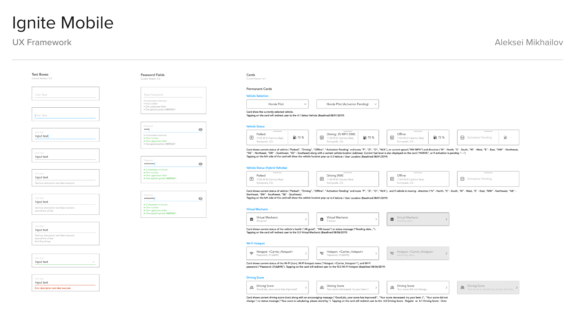
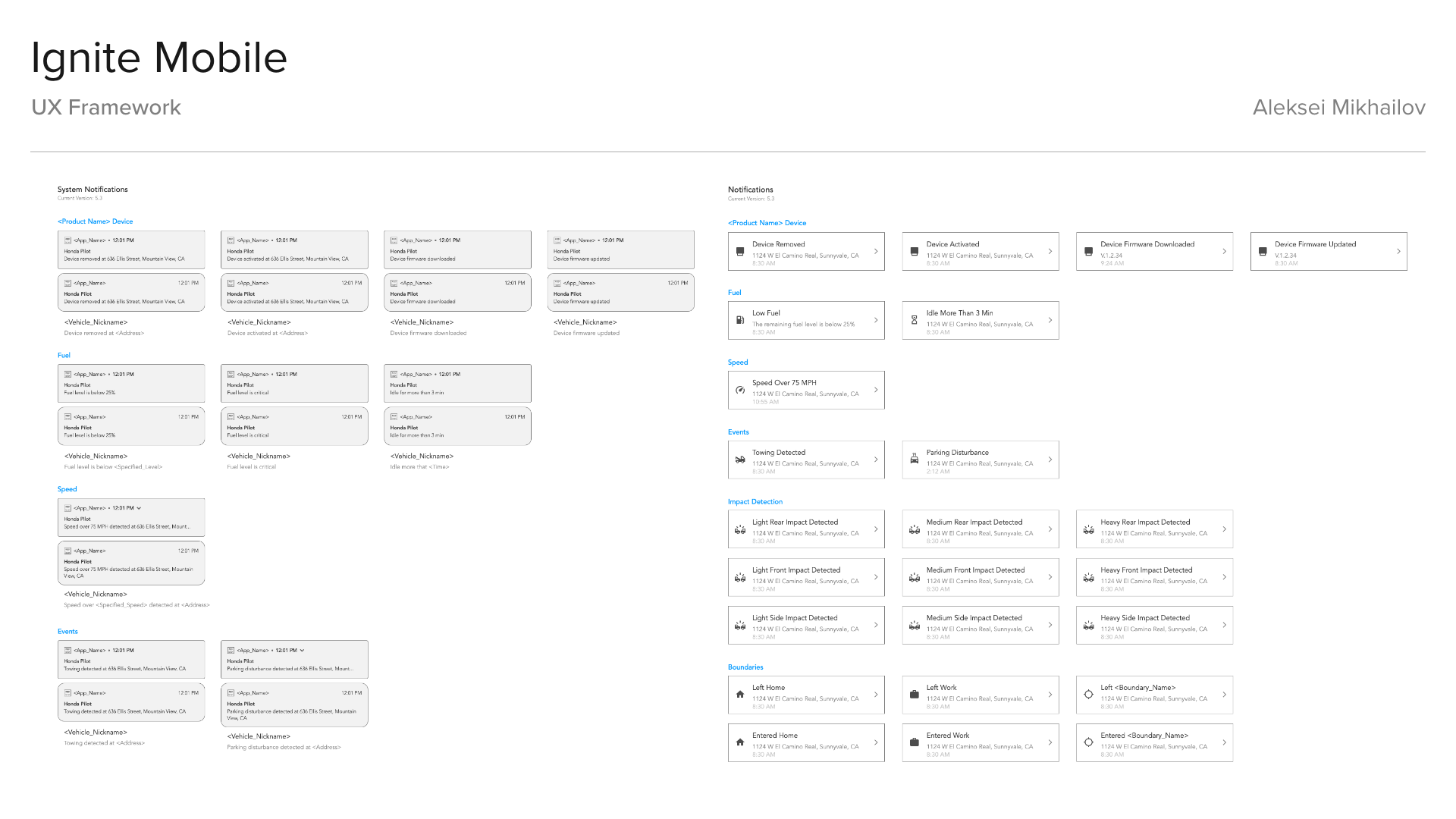

UX Framework
Testing
For testing of the app I created some functional low-fidelity prototypes in Axure RP, Adobe XD, testing was done internally by Sprint, and it confirmed the design direction and solutions and provided feedback for some tweaks to the UX.
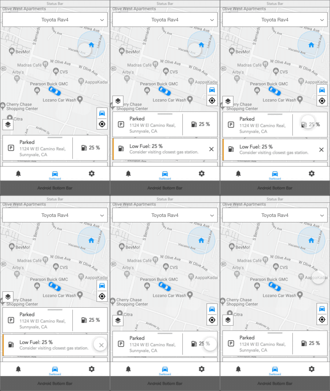
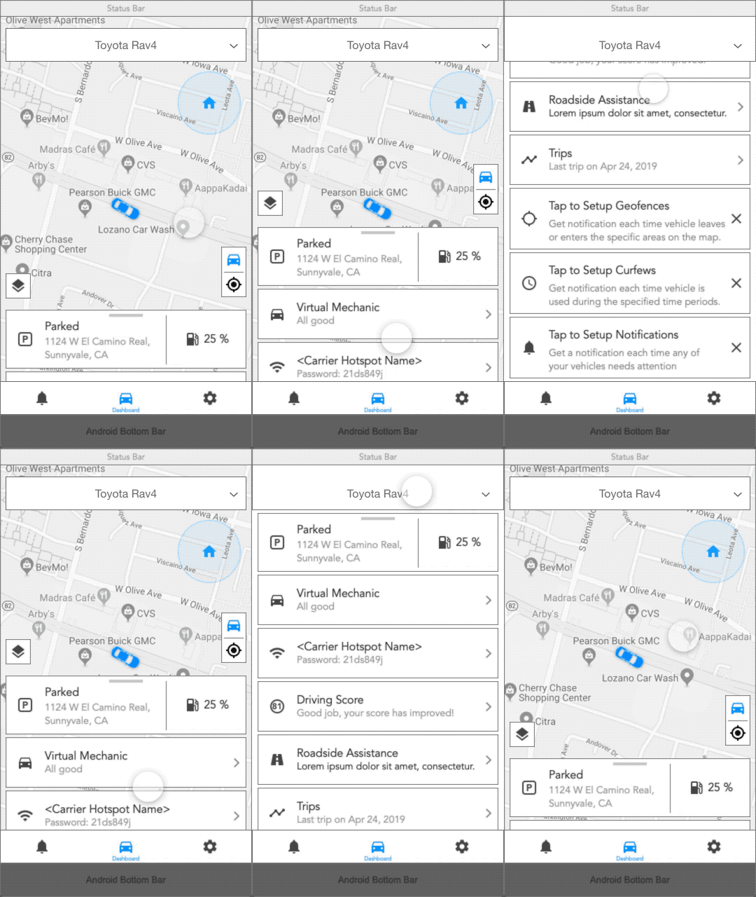

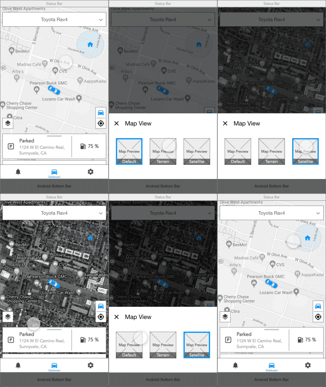
UX Framework Animations
Design Delivery
Then using the UX Framework I’ve started building UX wireframes and user flows, updating existing screens and adding new features, like:
• RepairPal Service;
• Maintenance Reminders;
• Impact Detection.
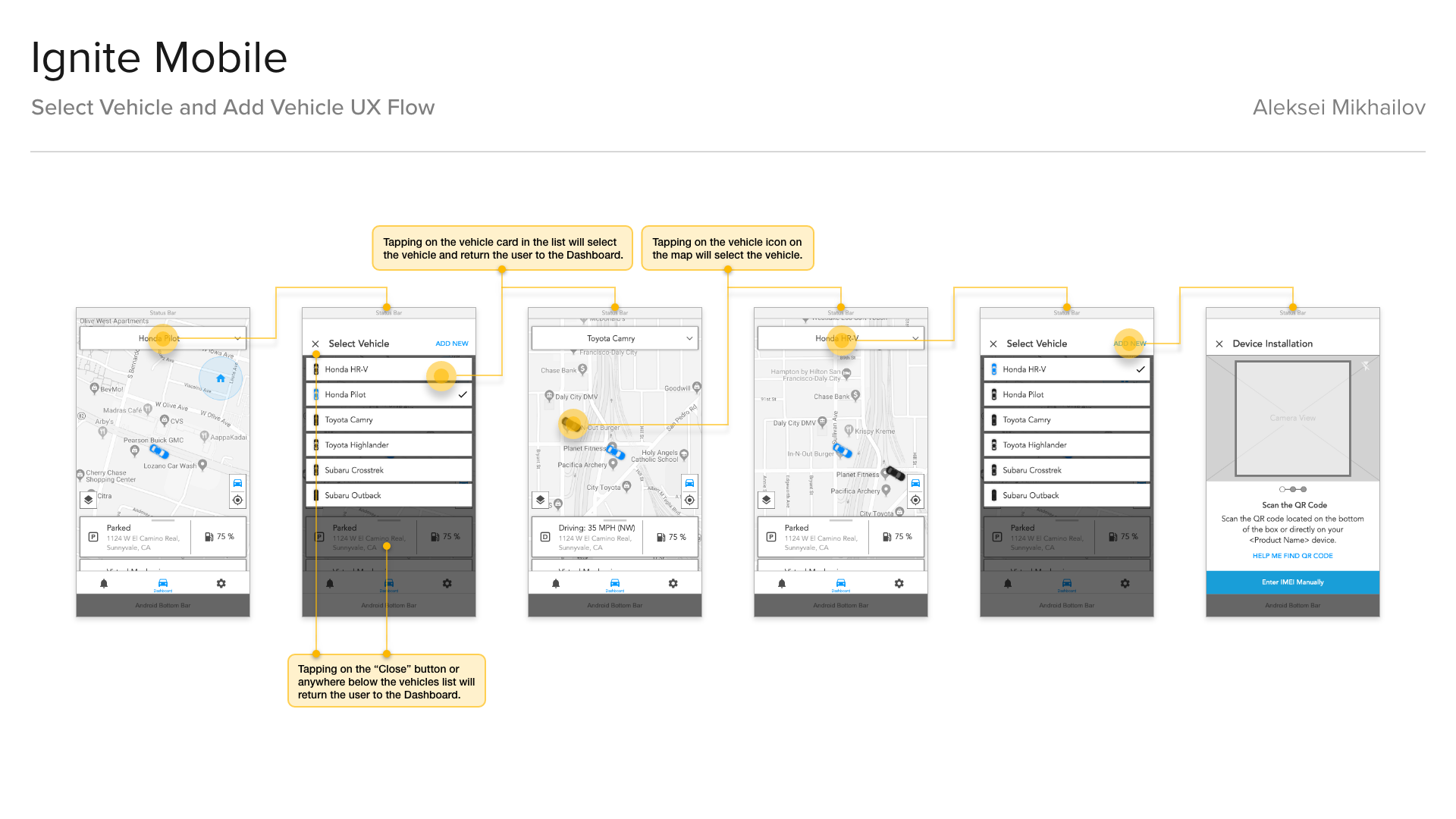
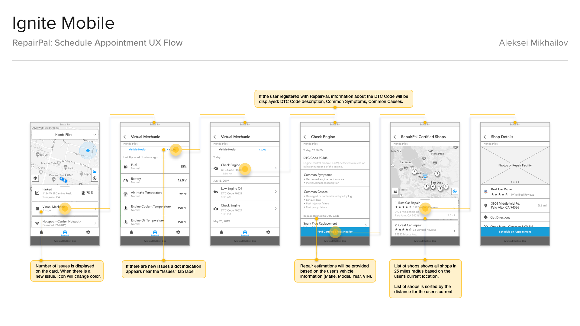
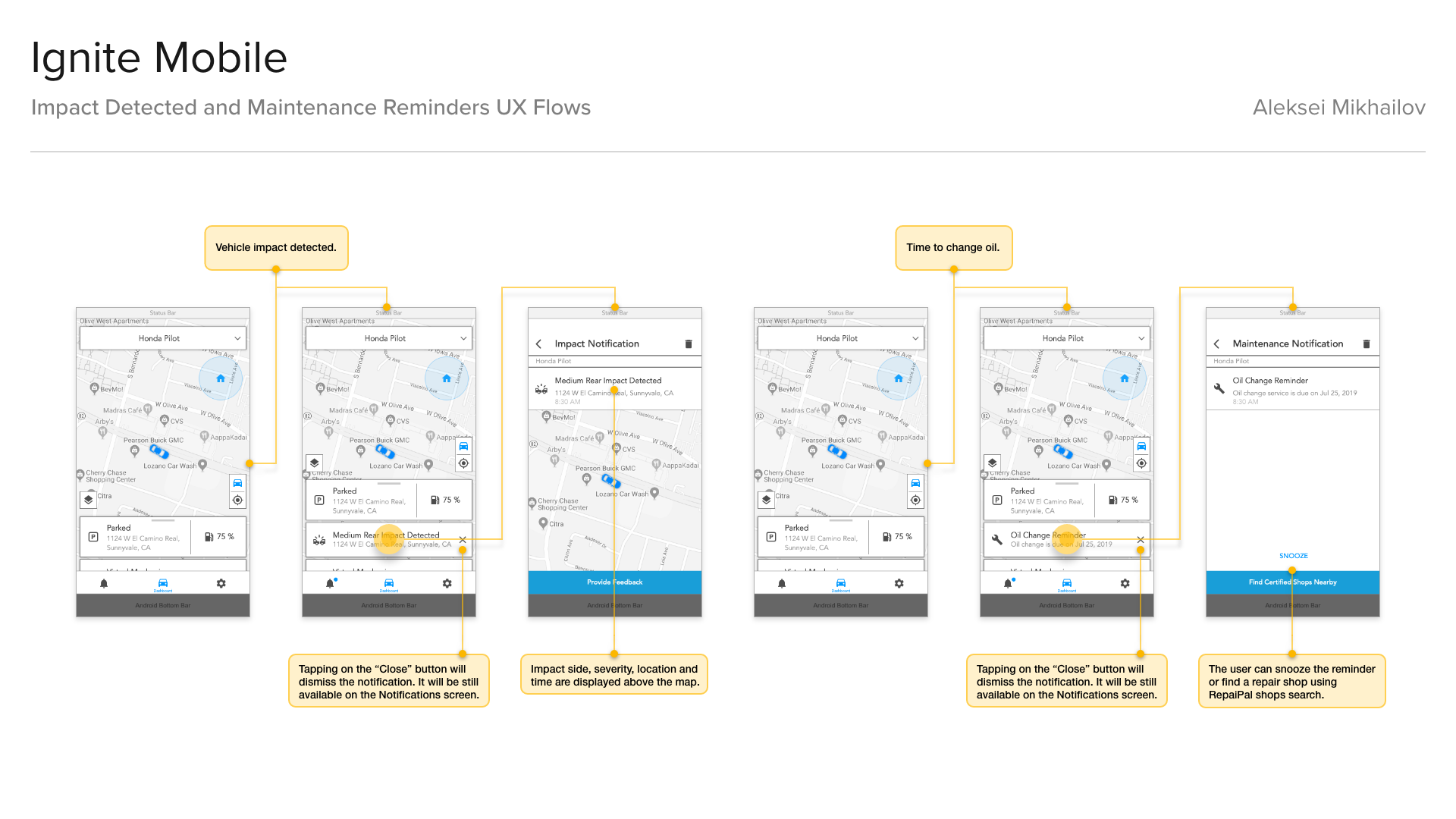
UX Wireframes
After all required changes were done to the UX wireframes and they were approved, I started working on the UI animations in After Effects to showcase new features - this was asked by Sprint.
This was done to ease the “pain of changes”, which is a pretty common thing - when users may feel frustration and anxiety when it comes to “sudden” changes in the product that they were used to. Animations that I’ve created were showing new UI changes and new features in an entertaining way.
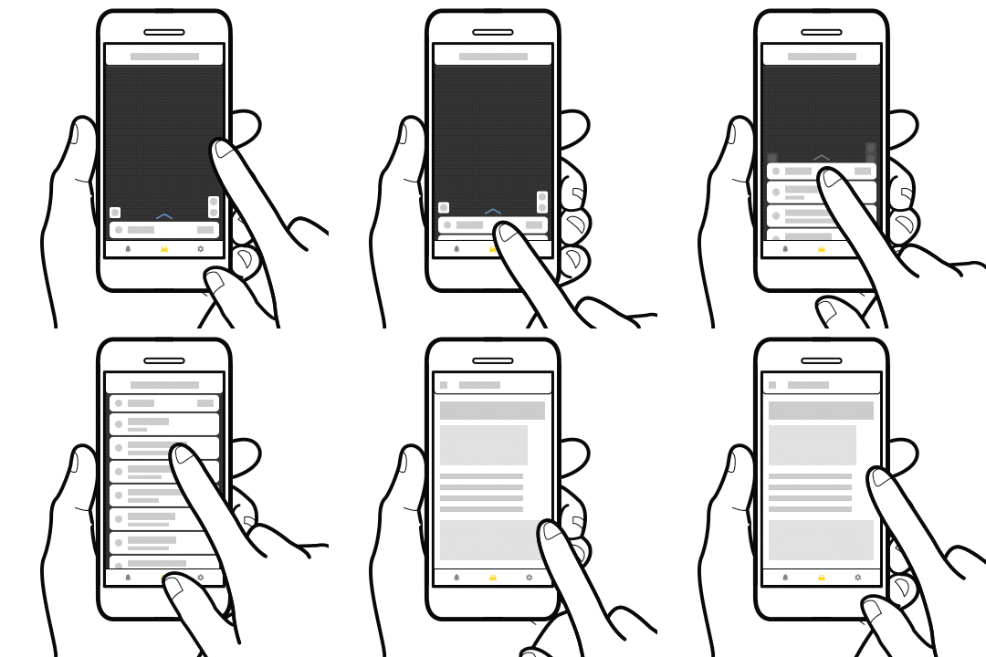
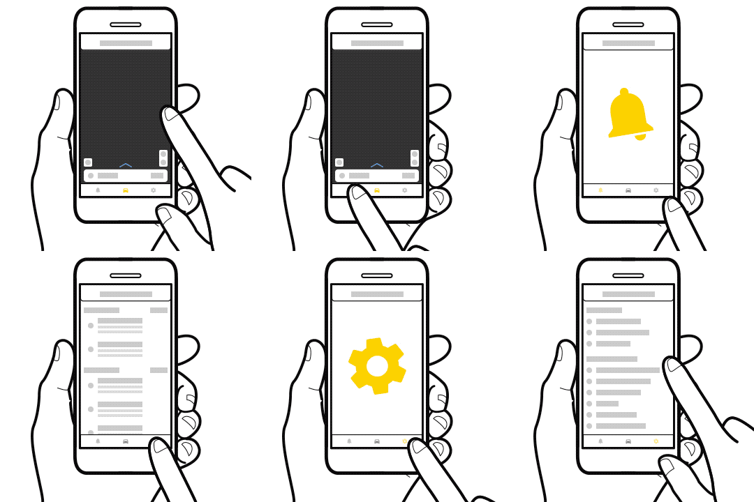
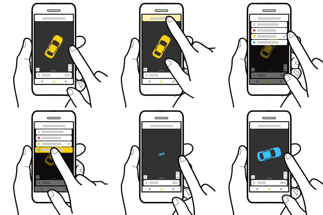

Animations for "What's New" Screens
Design System
In parallel to creating UX wireframes, and animations I started creating Components Library in Figma, and style guides for remote junior visual designers who were creating final mockups for key screens based on wireframes.
I created design files and followed a specific file organization in the Figma, similar to the UX wireframes in Axure RP.
I created design files and followed a specific file organization in the Figma, similar to the UX wireframes in Axure RP.
In parallel to helping 2 remote junior designers with mobile screens, and design file maintenance, I started working on final web app mockups, some marketing materials for Sprint, and Quick Start Guide updates.
Adding features parity between web and mobile apps, and adding some specific fleet management features to the web app.
Adding features parity between web and mobile apps, and adding some specific fleet management features to the web app.
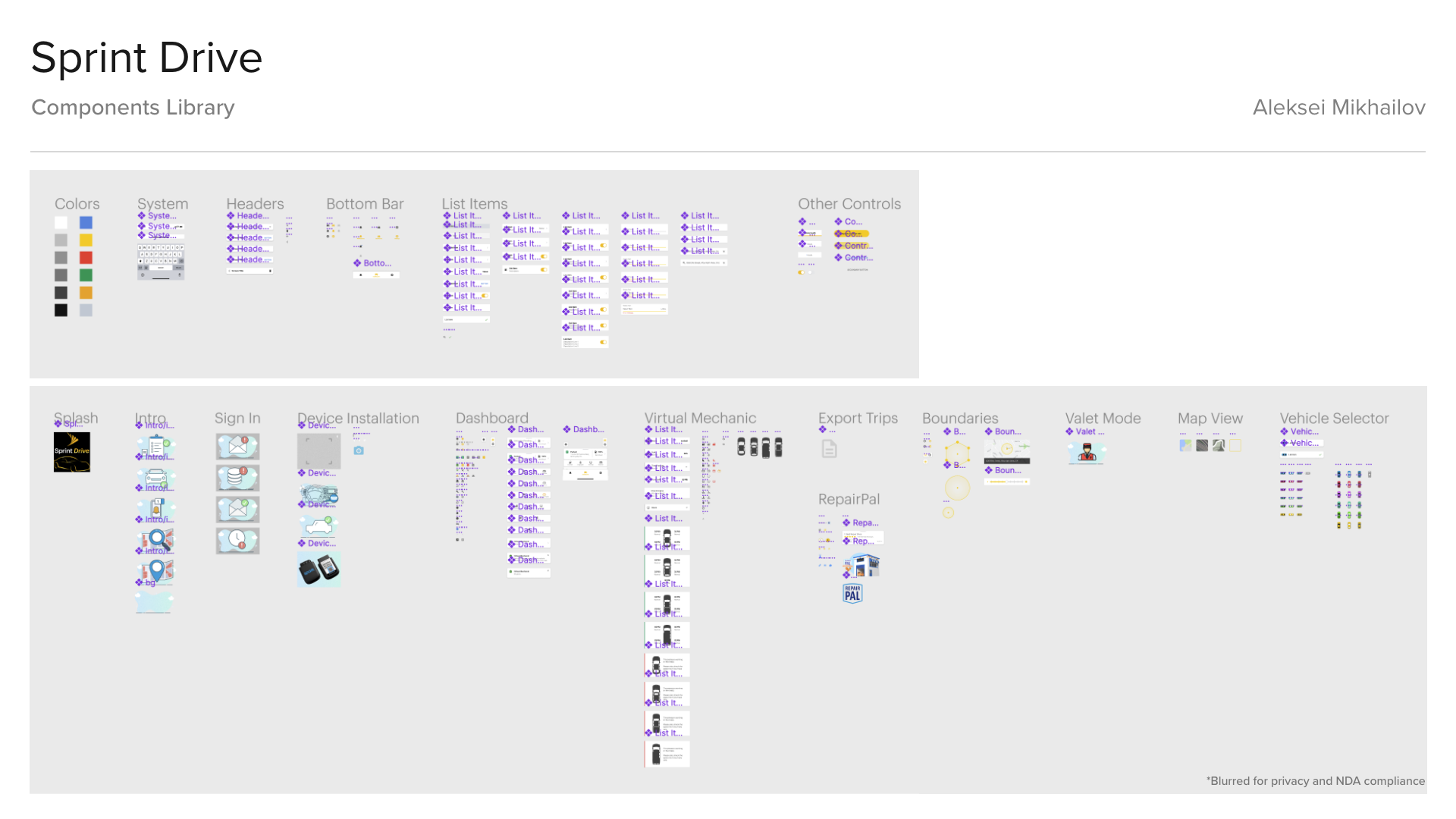
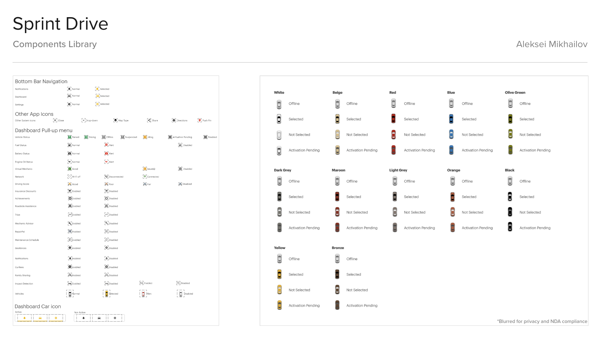
Components Library
I've created a Proto.io prototype with the updated UI and UX for Sprint Drive app, so the end customers could play with the app before buying the product. Since first launch in September 2019, the prototype was viewed by more than 14000 unique visitors.
Results
The result was an improved connected car platform for Sprint that addressed UX and business issues, added new features and system flexibility for the future updates.
The new UX architecture of the platform, the streamlined re-skinning process and features list customization allowed to launch similar connected car products in the Canada, Europe, Japan and India, all personalized and tailored to the specific needs of the users and businesses in the respective regions.
The new UX architecture of the platform, the streamlined re-skinning process and features list customization allowed to launch similar connected car products in the Canada, Europe, Japan and India, all personalized and tailored to the specific needs of the users and businesses in the respective regions.
Improved UX design increased app store ratings for Sprint Drive (Android: 4.8, iOS: 4.8), AT&T HARMAN Spark (Android: 4.5, iOS: 4.7).
New features are still being developed and gradually will be added to the platform (mobile app and website).
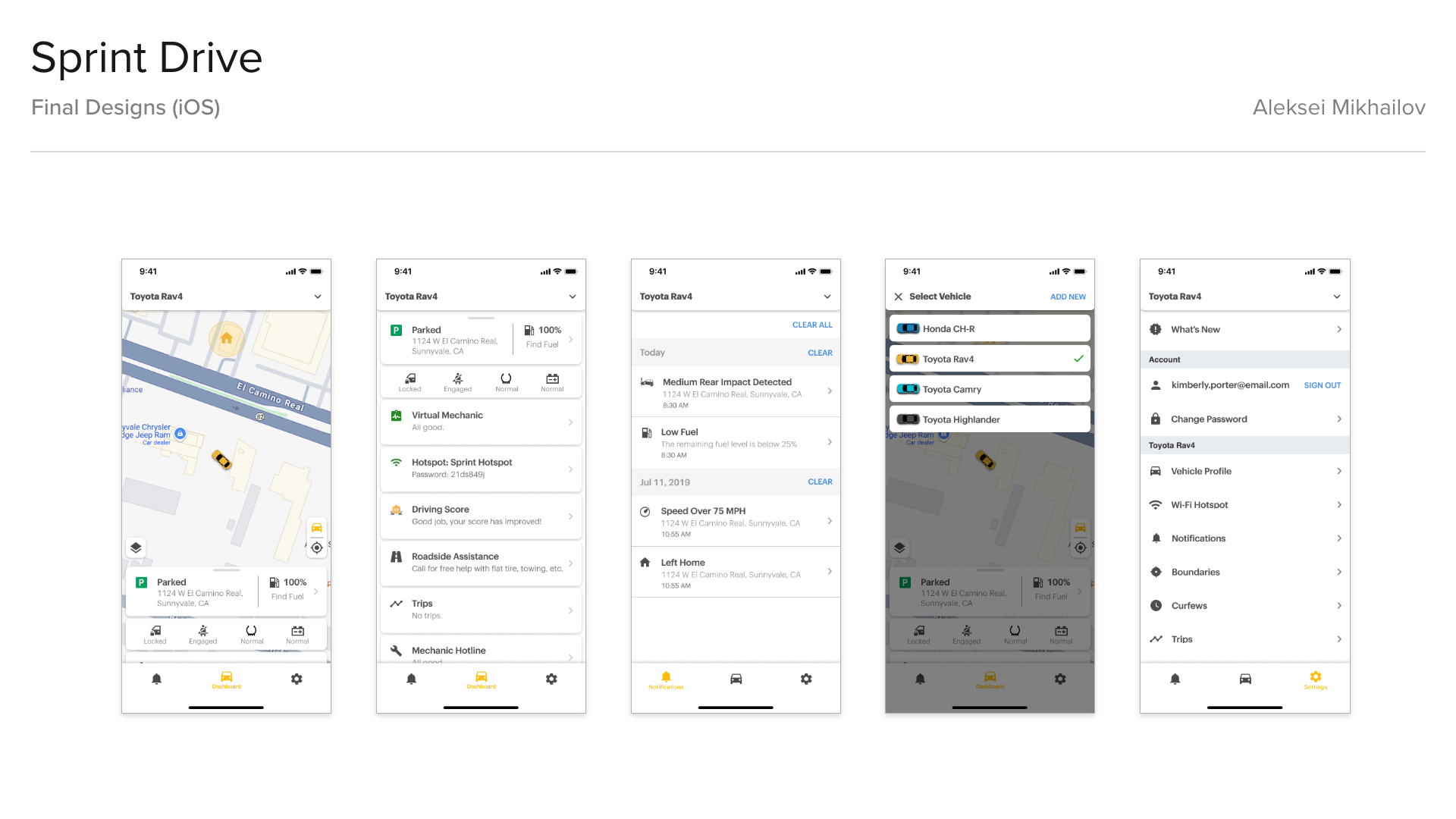
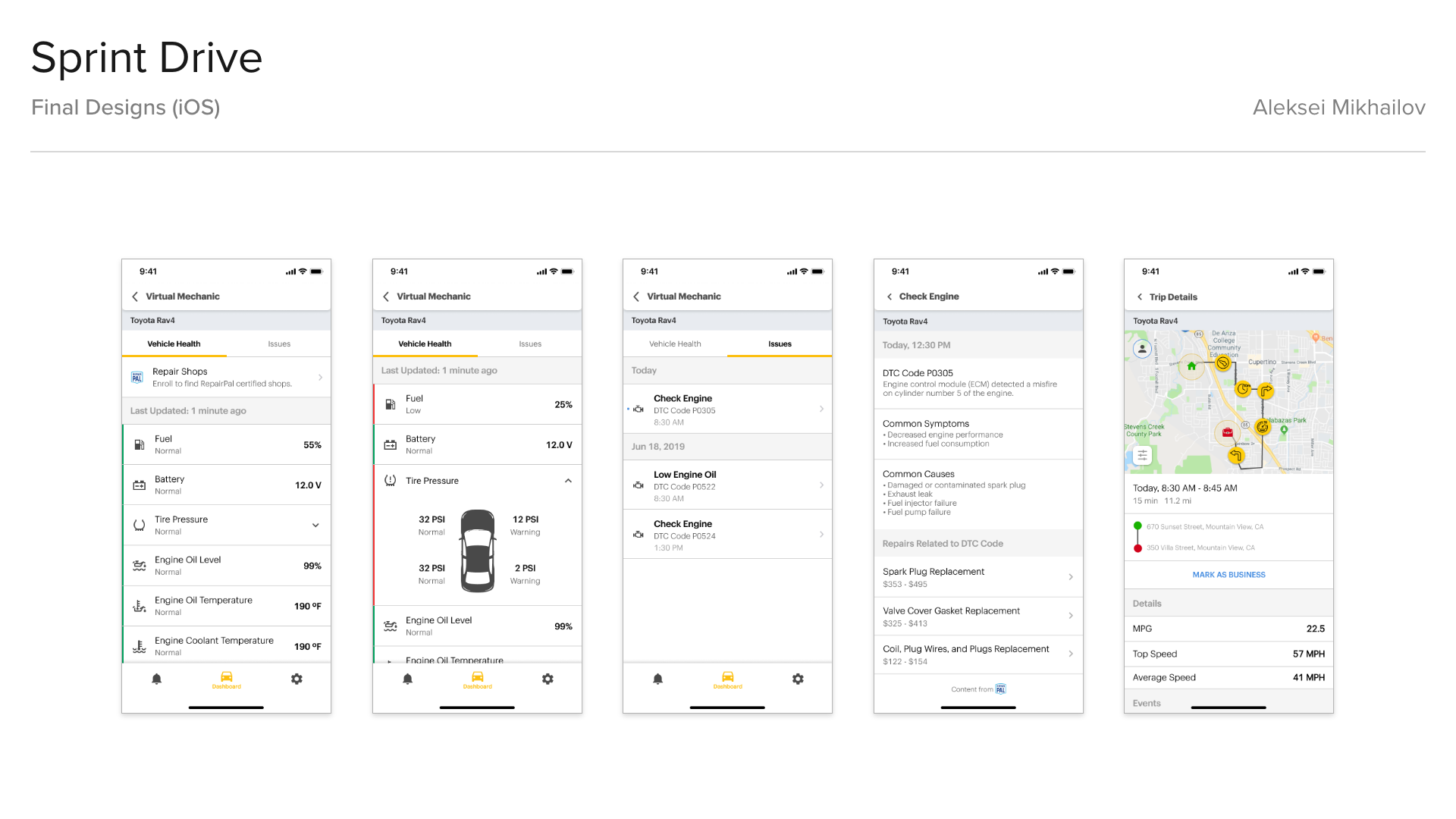

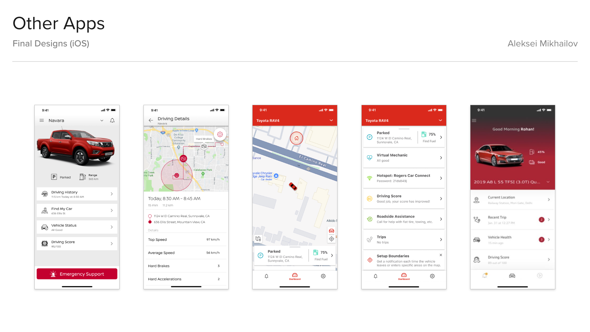
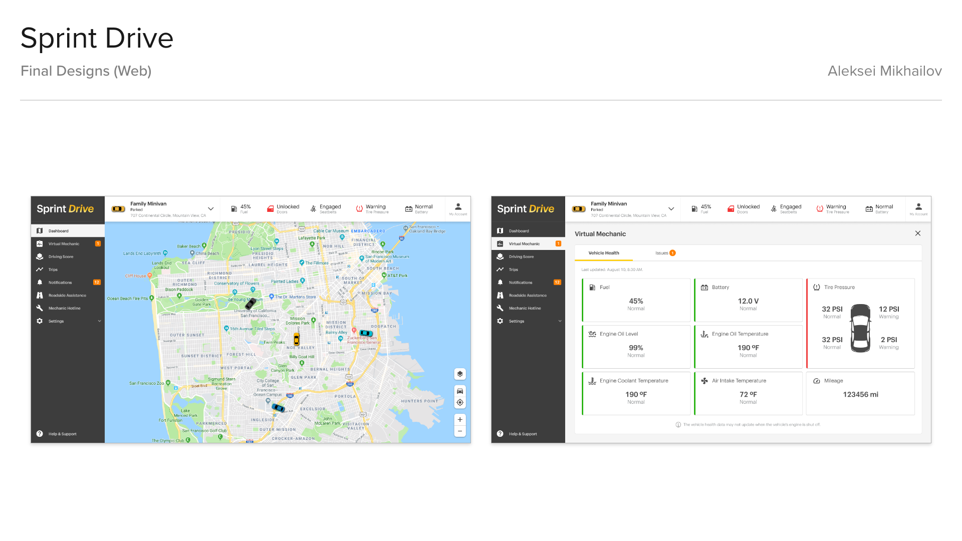
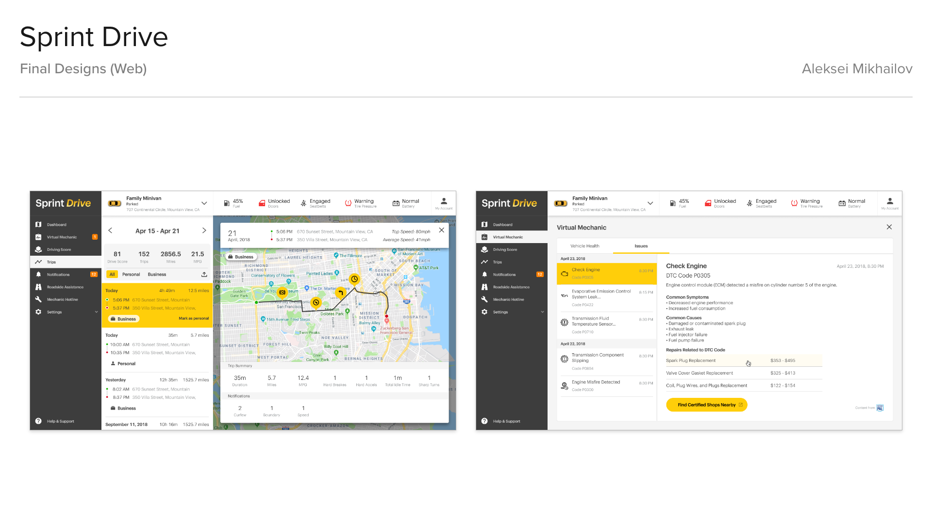

Visual Design Mockups
All screens, images, sketches, wireframes, visual designs, user experience designs, animations, industrial designs, 3D models, 3D model renders featured on this page are the intellectual property of the respective companies for which they were created. These works are showcased here for portfolio purposes only. All rights are reserved by the respective copyright owners. No part of this portfolio may be reproduced, distributed, or transmitted in any form or by any means, including photocopying, recording, or other electronic or mechanical methods, without the prior written permission of the copyright owner.