Links: Website | App Store | Play Store
Intro
SAP SuccessFactors Learning module is one of the modules of larger SAP’s enterprise platform, which is used by thousands of companies and millions of employees across the globe.
Learning is a compliance tool for pilots, government employees, factory workers and others, and it is also and upskilling platform.
I was leading an end-to-end redesign of the Learning module, focusing on the Learning Home page, and some of it’s components like Curriculum and Compliance, Required Learning, Custom Content, Admin Tools and AI-powered Recommendations.
SAP SuccessFactors Learning isn't just about ticking compliance boxes. It's about fostering a culture of lifelong learning, where curiosity and growth are celebrated. That means breaking down departmental barriers and making learning a company-wide initiative. At the heart of it all lies the talent intelligence hub—an invaluable resource for understanding current skills, identifying gaps, and charting a course for the future. With machine learning and AI-driven recommendations, powered by the talent intelligence hub, it delivers personalized recommendations that propel individuals toward their career aspirations. Think of it as your one-stop shop for skill-building, compliance training, and discovering new growth opportunities—all infused with the power of responsible AI.
The main goal of the project was to reimagine and redesign legacy Learning experience to introduce new capabilities and new SAP Fiori design language.
Due to the NDA only a few specific screens can be show to the public.
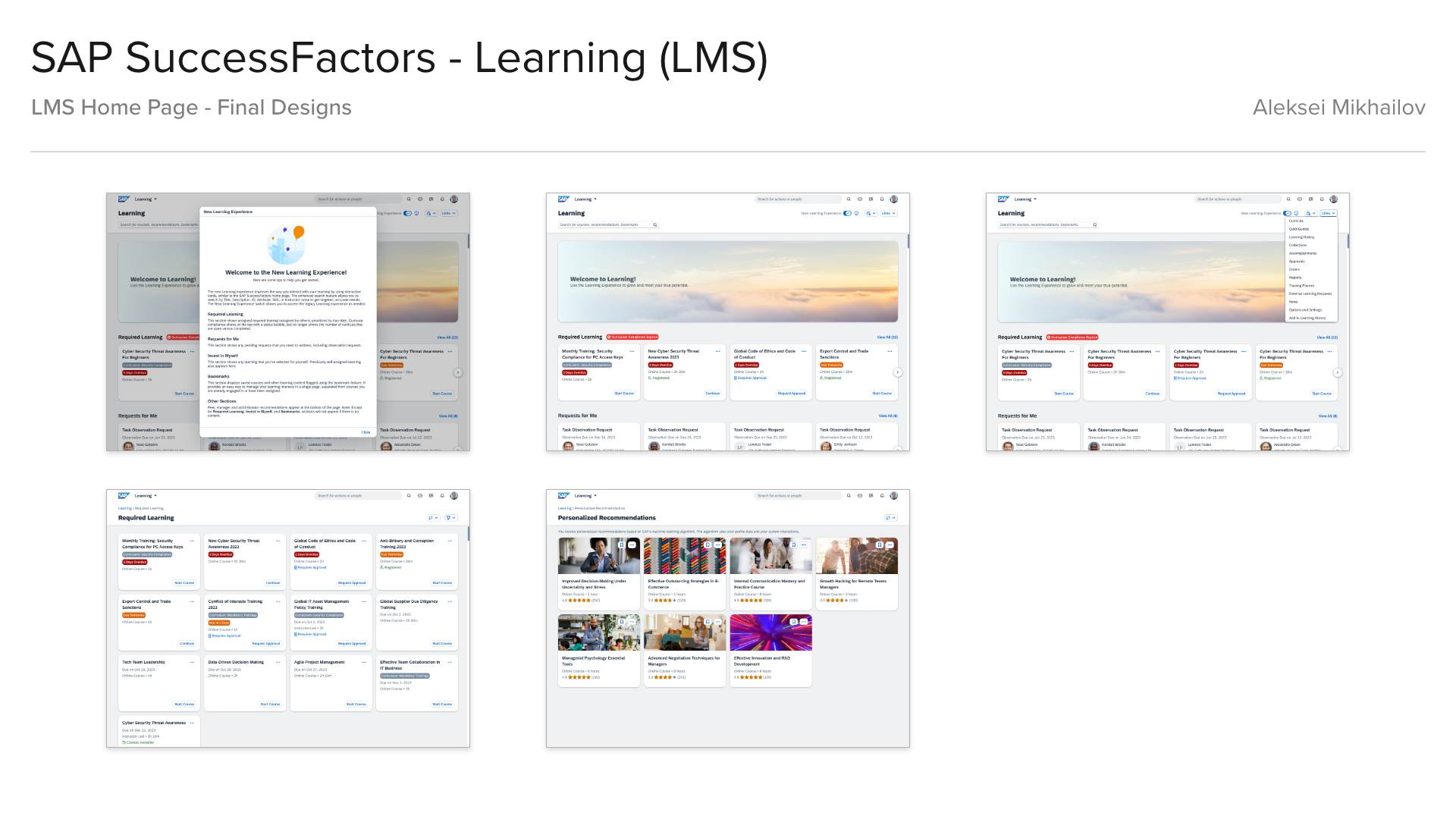
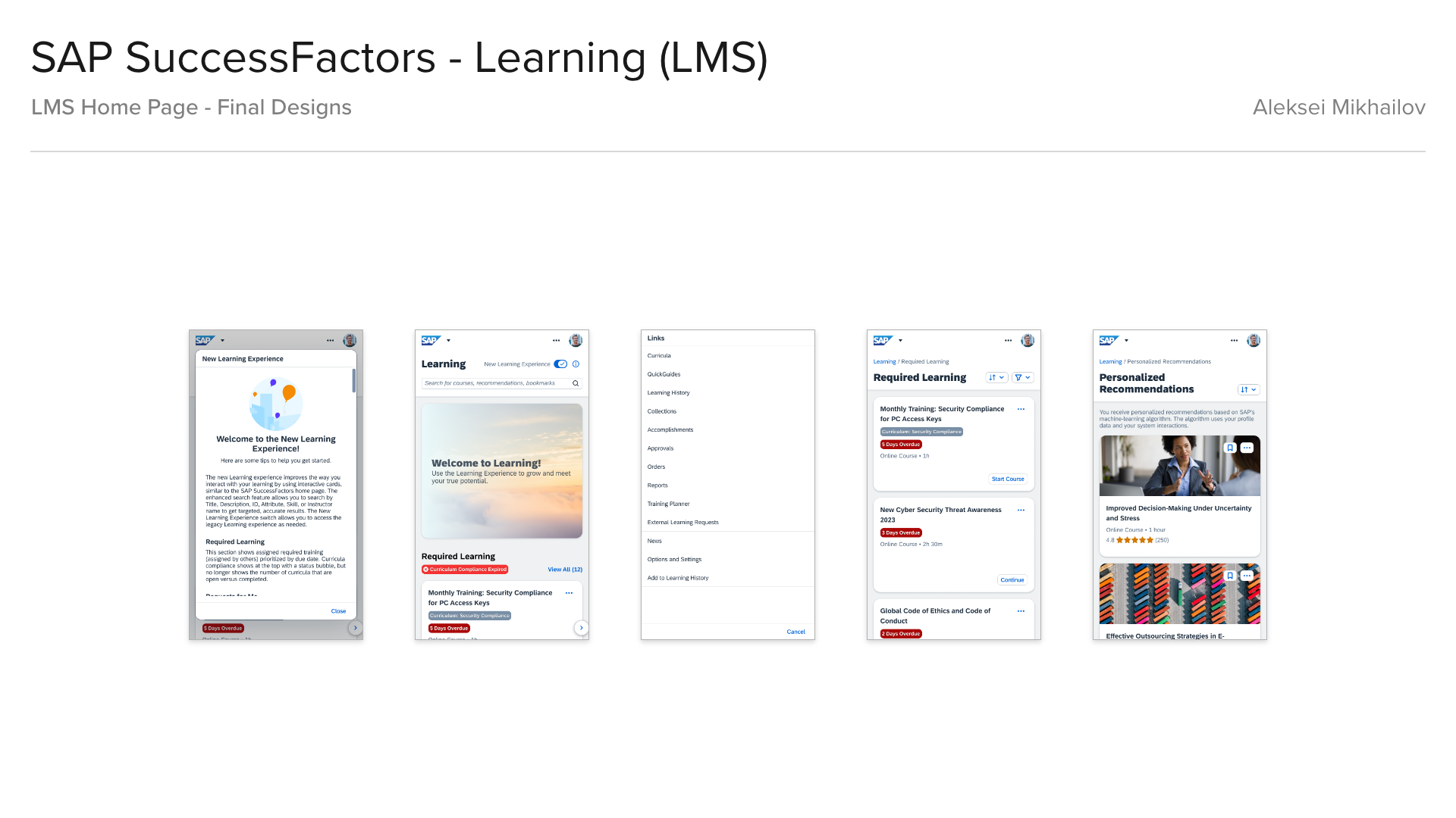
Learning Home Page - Final Design
Process
I always start with the Design System, as you cannot build a house without a proper foundation, and even though SAP had their comprehensive design processes and design libraries, I had introduced some more organizational techniques and process enhancements:
• Design epic as a “folder” in Figma with separate templated pages.
• Separate numbered flows for each user story.
• Tags showing current design status, notes, etc.
• Numbered flows, sub-flows, screens for easy reference and change logs.
• Labeled user journey arrows, notes under screens with detailed behavior descriptions, references, links or/and questions to Engineering, Product, UA, Research.
• Recording all changes to flows/screens into a change log.
Research
During a workshop between Product, Engineering and Design team we collaboratively outlined a rough vision for the future of the Learning Home page, breaking down employee’s and company’s needs into 3 categories:
Have to Learn:
• Safety and compliance.
• Mandatory assignments and required training.
• Mandatory assignments and required training.
Need to Learn:
• Excel in the current role, job, team.
• Work effectively with colleagues.
• Work effectively with colleagues.
Want to Learn:
• Learn based on interests, aspirations, motivations.
• Drive a culture of learning with personal goals.
• Drive a culture of learning with personal goals.
During the research phase I was collaborating with User Research team and Product team on gathering data from the employees (end users) and customers, on what challenges they had with the legacy system and what they would like to see improved:
• Challenges with the usability and accessibility.
• Lack of intuitive navigation, difficulty in finding relevant content.
• Challenges with flexibility in adding new content and features.
• Information overload.
• Limited personalization options for customers and end users.
• Difficulties in tracking learning progress.
• A need for a training on-the-go.
• Outdated and complex admin tools.
Brainstorming
The next step was brainstorming started with analysis of all the gathered data, identifying and grouping pain points and thinking about creative solutions (this was done in collaboration with design team).
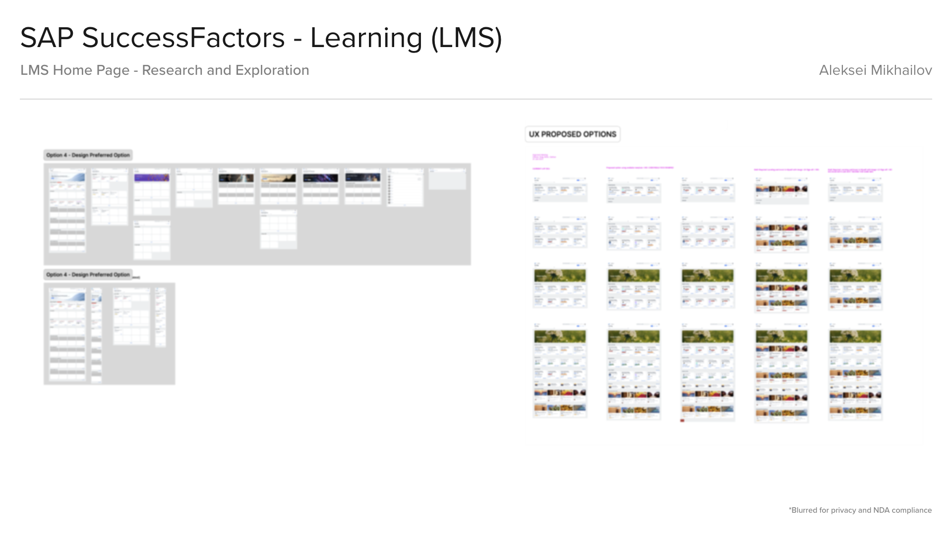
I started creating a new Information Architecture based on the proposed solutions. After that I started sketching some draft ideas of the user flows, trying to use only standard design components. Then I continued with some more explorations and Learning Home Page and some design options.
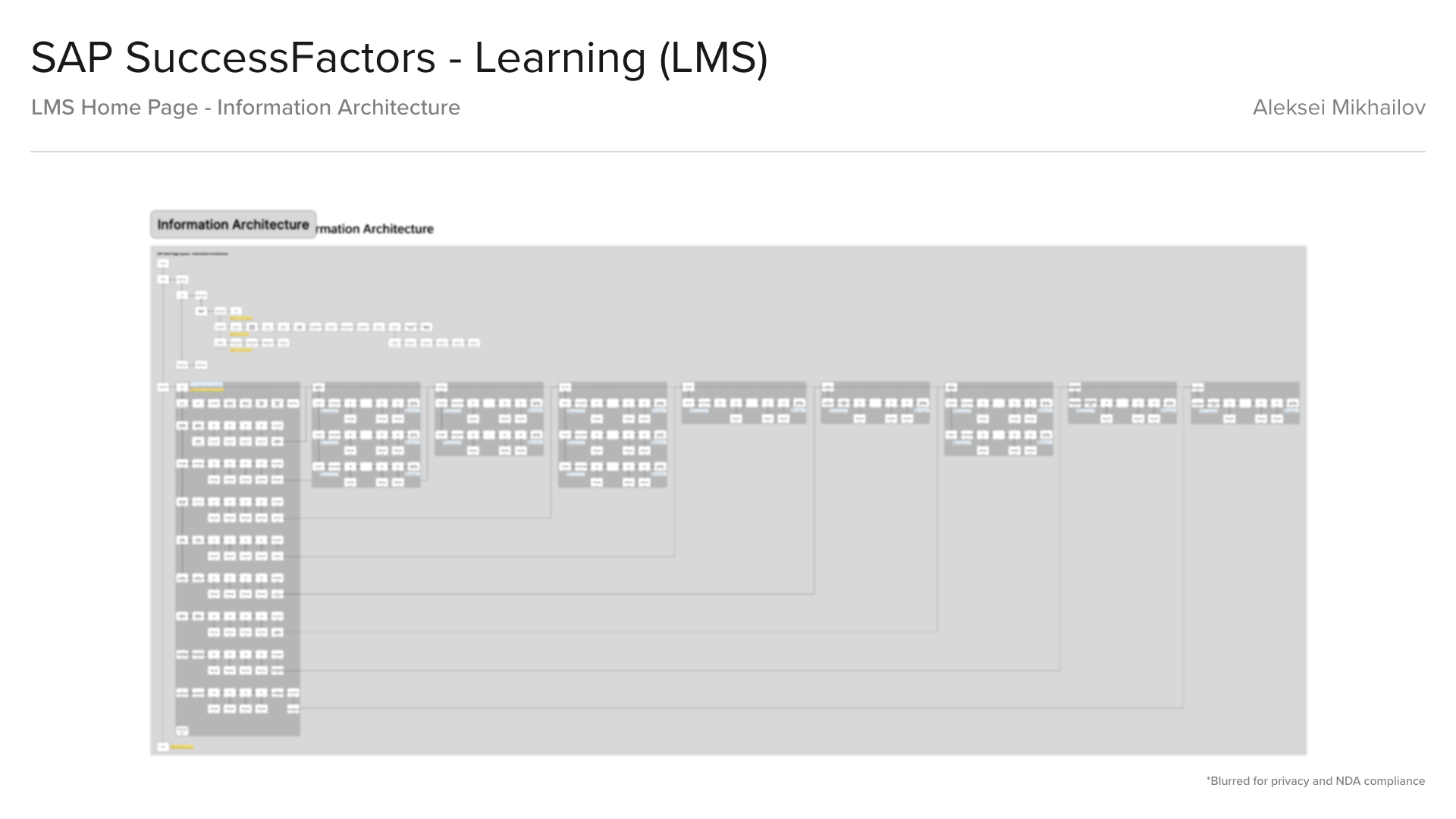
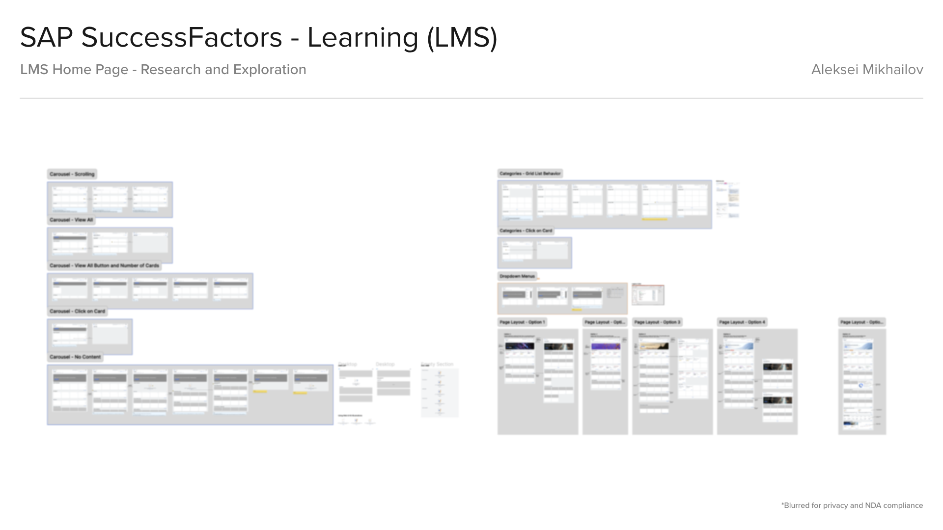
Learning Home Page - Research and Exploration
In response to the UX pain points, the new learning design system introduced a series of UX enhancements and new features:
• A more intuitive and user-friendly interface that simplifies navigation and makes learning content more accessible.
• Increased customization capabilities allowing customers and users to tailor their learning experiences to individual preferences and needs.
• Advanced tracking features that provide detailed insights into a user's learning progress, enabling better monitoring and support by educators and administrators.
• Prioritized content sections ("have to learn", "need to learn", "want to learn").
• AI-powered recommendations.
• One-click calendar integration.
• Social learning elements.
• One-click calendar integration.
• Social learning elements.
• Created responsive card-based interface, with offline-enabled mobile experience.
• Cards and pages displaying custom HTML content and other types custom content.
Alignment and Testing
During the alignment phase different teams review all the proposed design sketches, providing feedback and inputs on the components, accessibility and feasibility. And adjust planning accordingly if needed. And review all the created design foundation and finalize concepts for all the key screens.
Before the testing phase began, I created functional high-fidelity and low-fidelity prototypes with approved design direction to test the design solutions (using UserZoom and Qualtrix surveys). And in parallel I was preparing a series of mini demos and static screens for design advisory sessions with customers and their representatives.
Before the testing phase began, I created functional high-fidelity and low-fidelity prototypes with approved design direction to test the design solutions (using UserZoom and Qualtrix surveys). And in parallel I was preparing a series of mini demos and static screens for design advisory sessions with customers and their representatives.
Initial testing showed 92% positive feedback on new web UI, 90% positive feedback on new mobile UI.
Design Delivery
During designing phase first I created UX wireframes for all use cases and user stories, errors and detailed descriptions of the components and screens behaviors. After UX wireframes finalized, reviewed and approved, Engineering and Product team used these as a source of truth for app behavior and a complete user flow. And this approach usually unblocks Engineering, they can already start implementation without waiting for visual mockups.
The next step was creating final mockups for key screens and collaboration with copywriters from the UA team on final wording and getting final approvals from other stakeholders. Engineering usually uses final mockups as a visual reference and for QA.
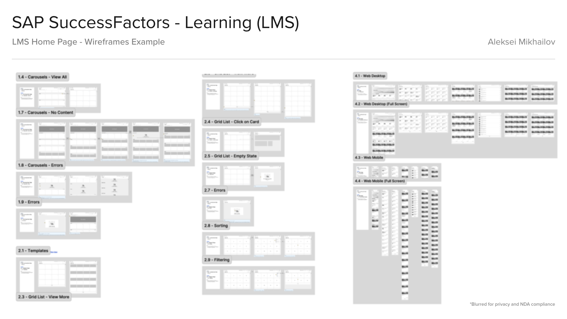
Learning Home Page - Wireframes
The next step was creating a11y annotations for all key screens and new and existing components. And creating new pages in Design Library with all new templates and components, with detailed descriptions and specs.
The final design delivery was done in a separate Figma file, that included UX wireframes, final mockups, a11y annotations.
The final design delivery was done in a separate Figma file, that included UX wireframes, final mockups, a11y annotations.
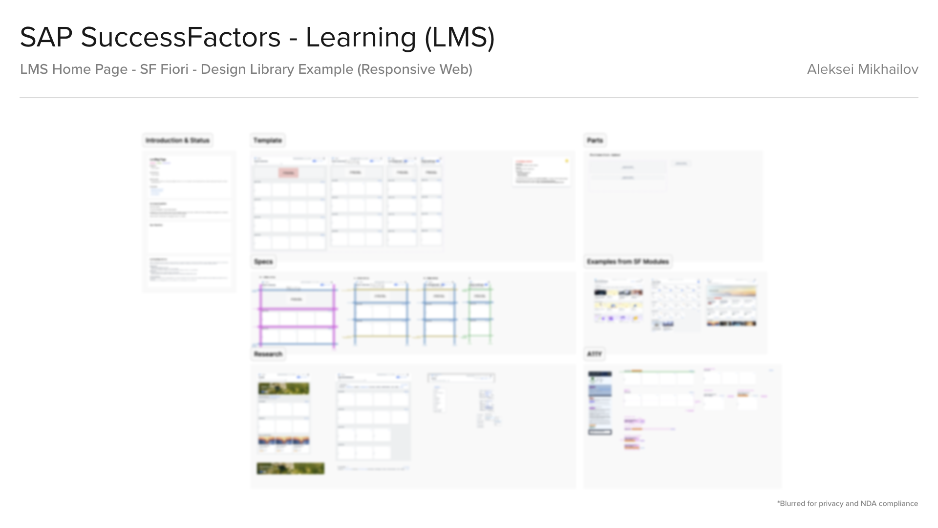
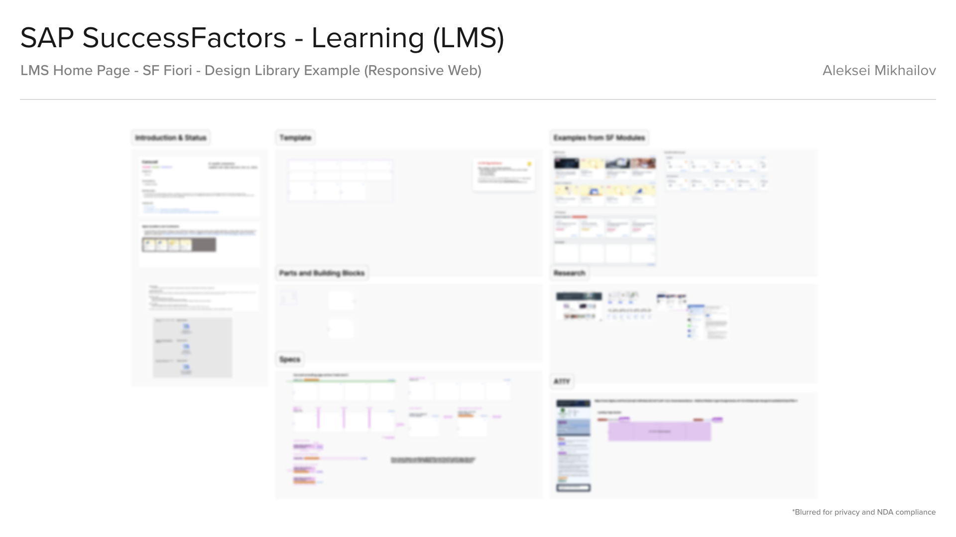
Learning Home Page - Design Library
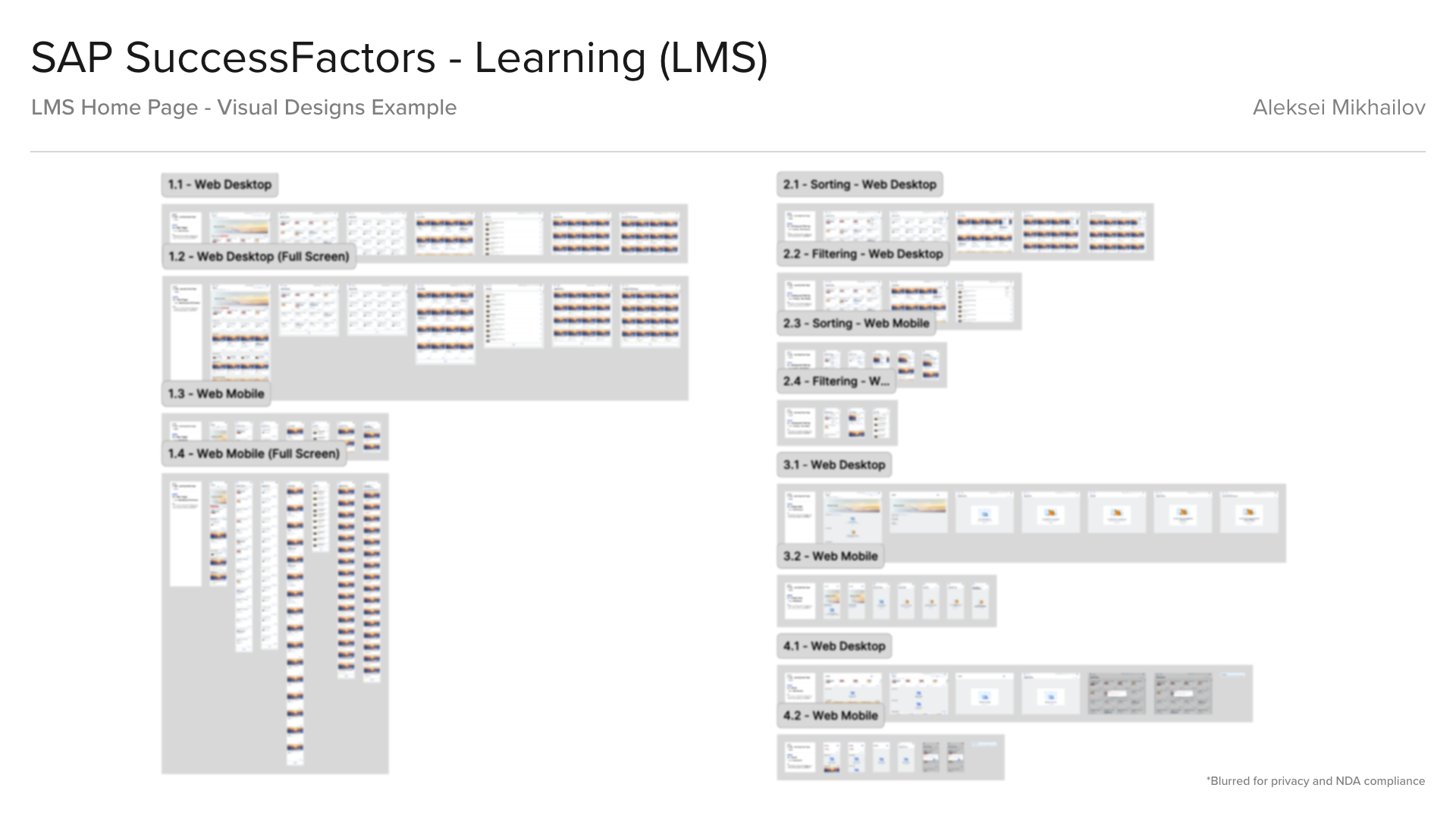
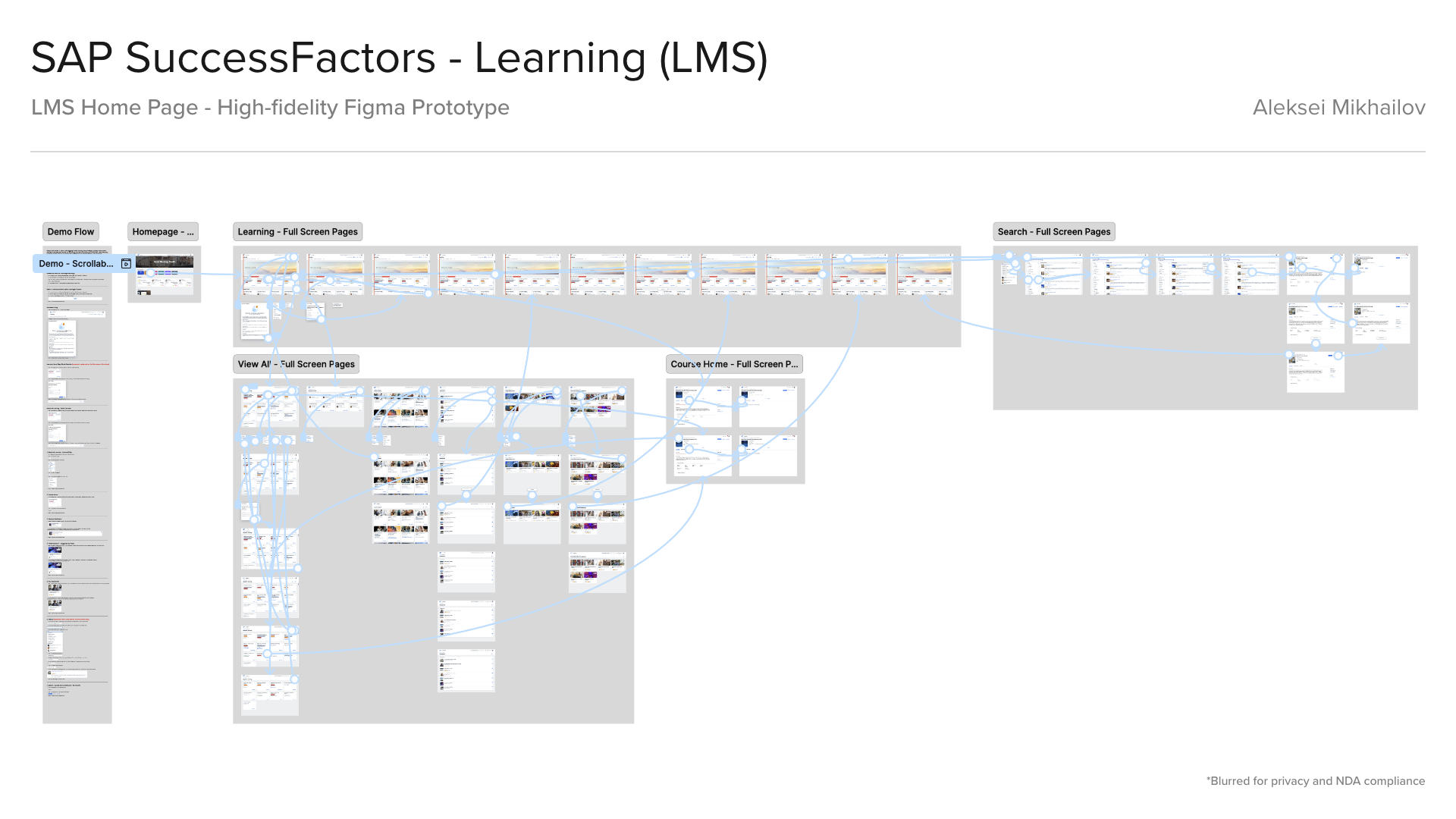
Learning Home Page - Visual Designs and High-Fidelity Prototype
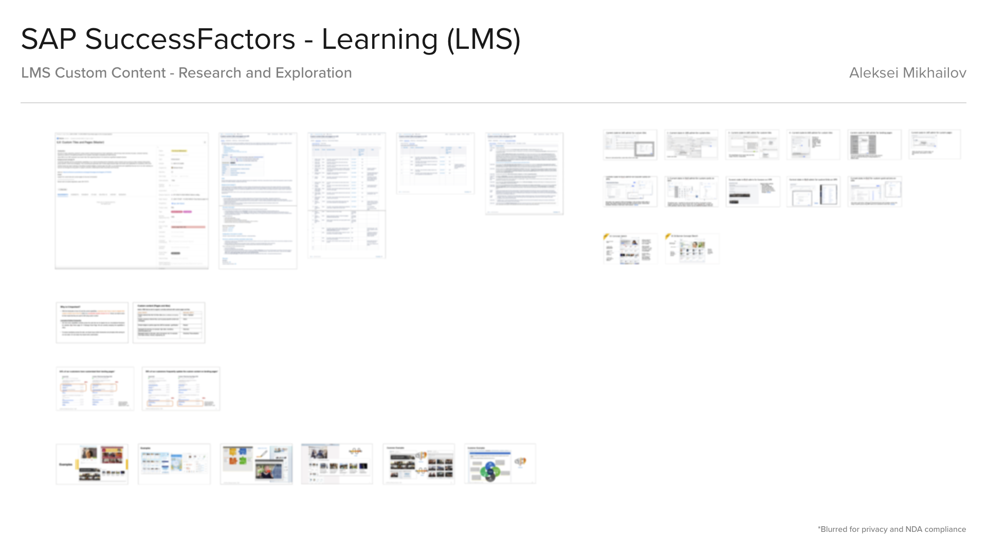
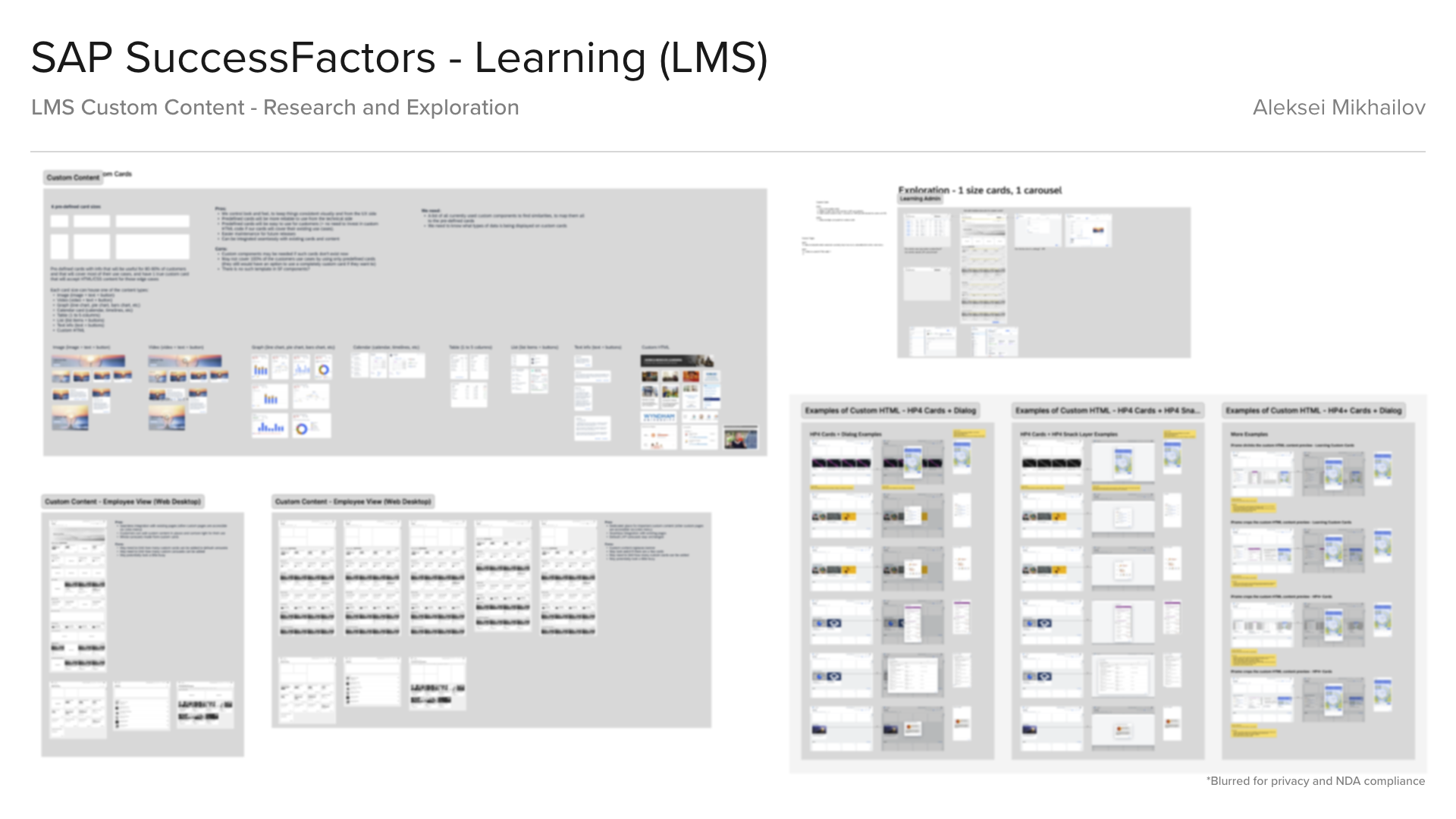
Learning Custom Content - Research and Exploration
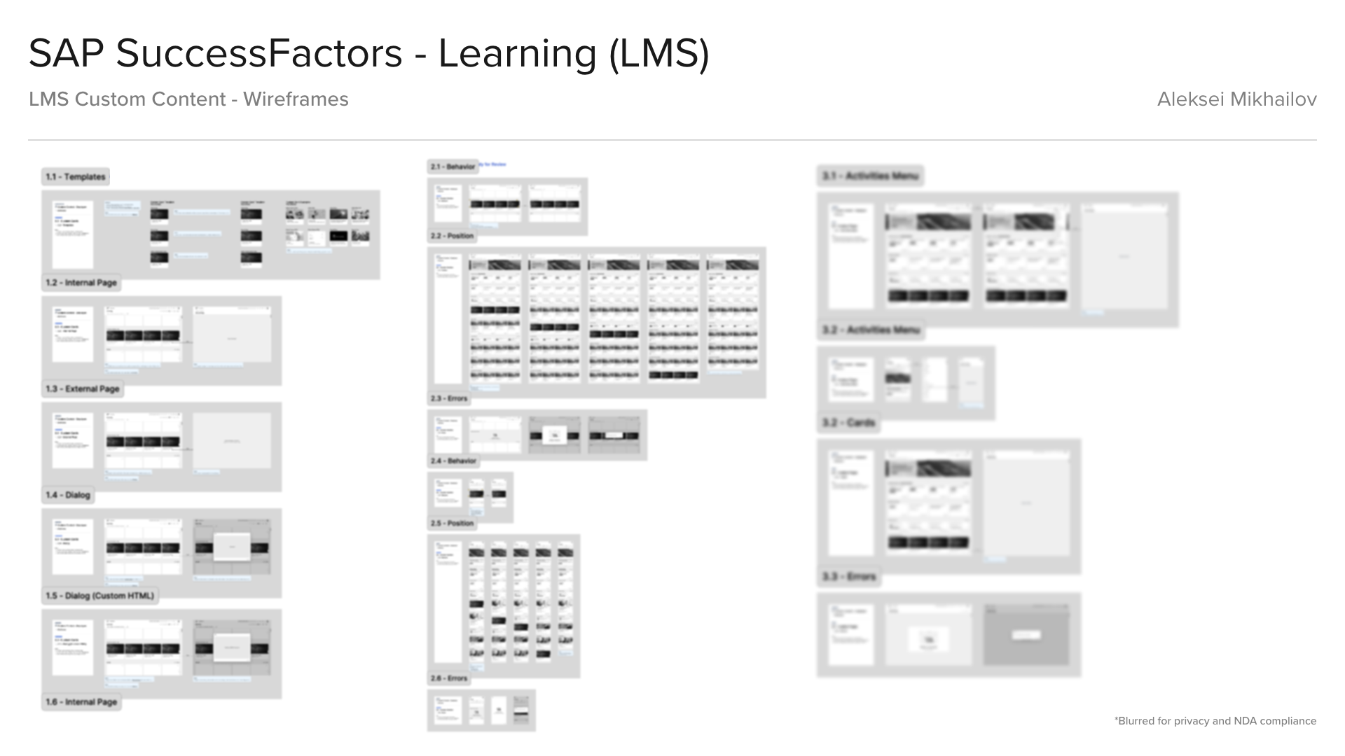

Learning Custom Content - Wireframes and Visual Design
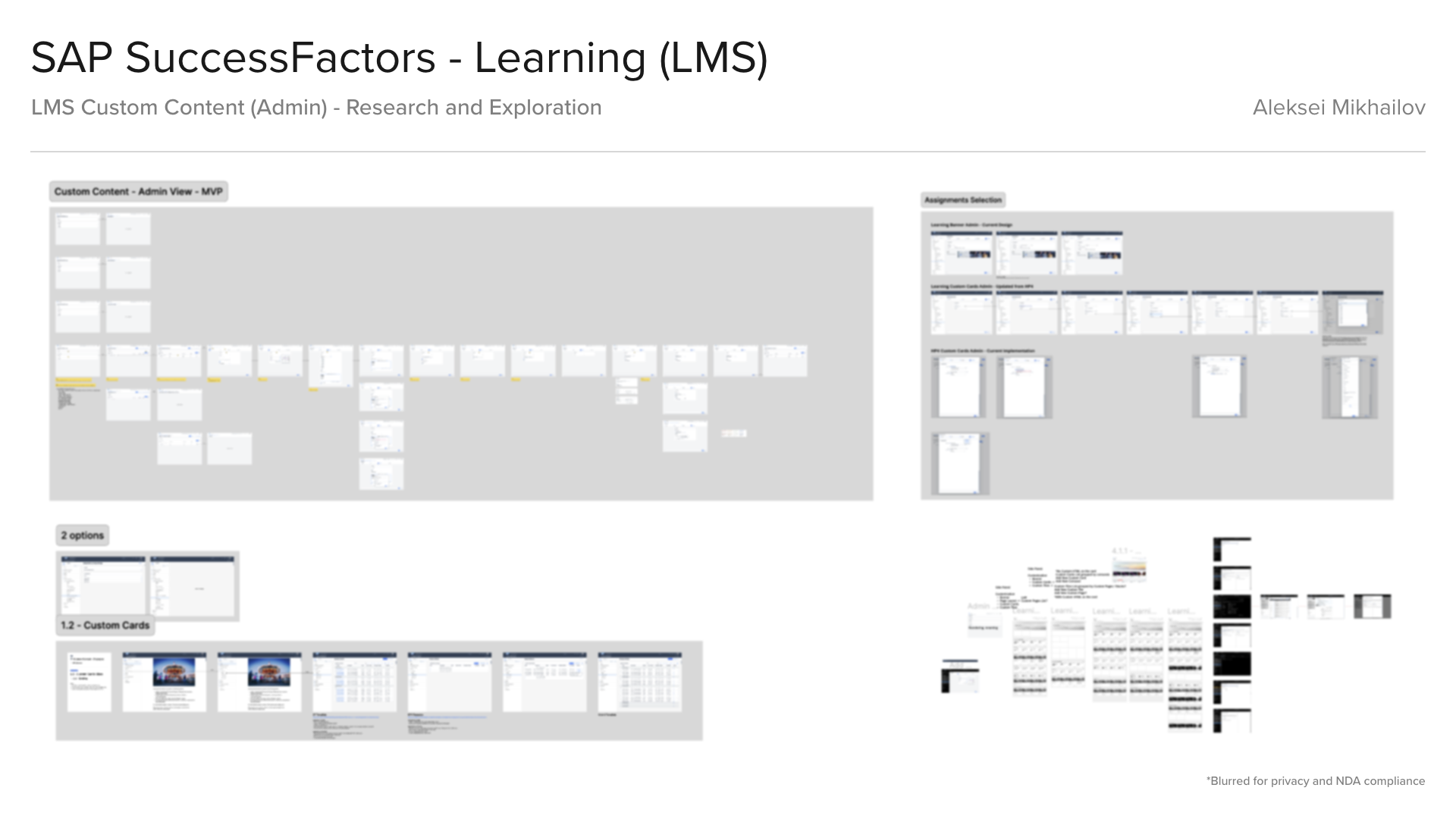
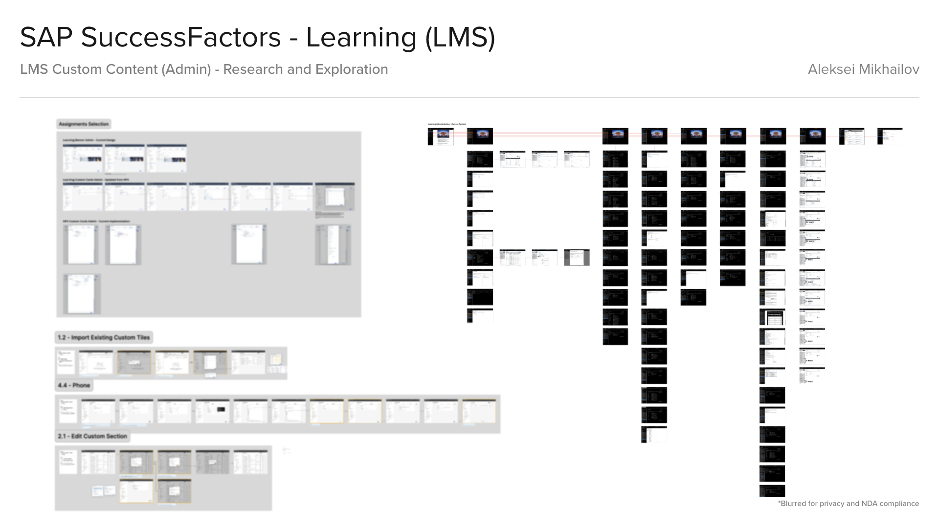
Learning Custom Content (Admin) - Research and Exploration
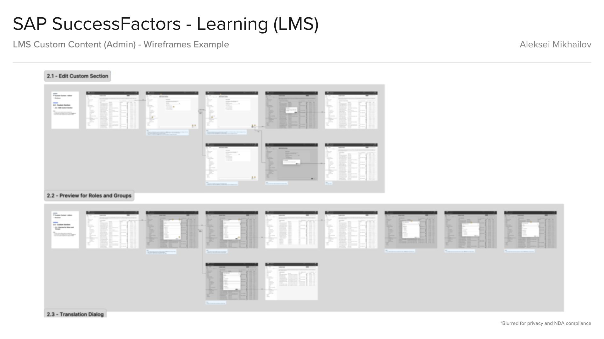
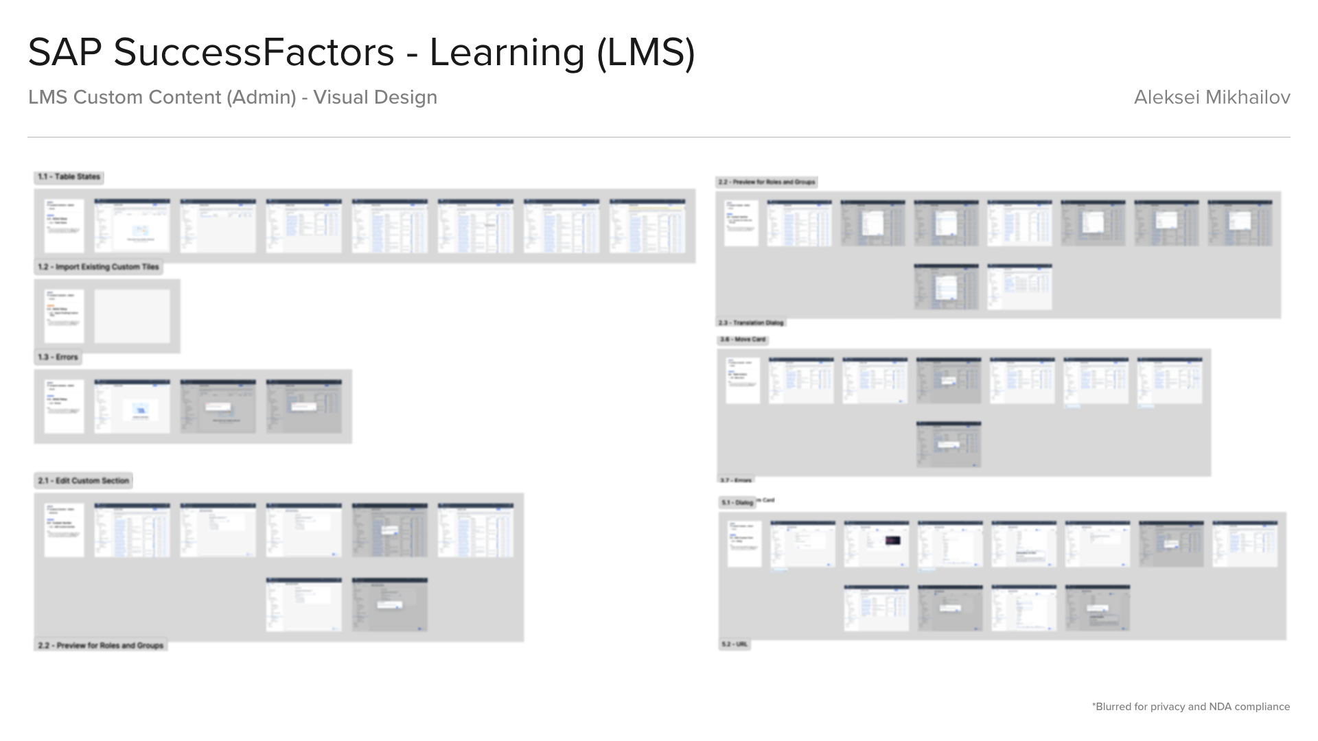
Learning Custom Content (Admin) - Wireframes and Visual Design
Results
The redesigned learner experience is highly personalized, prioritized, and organized to meet individual needs. It provides clear guidance on the learning items learners "have to learn," such as mandatory learning for safety and compliance; those they "need to learn" to excel in their roles and achieve business objectives; and those they "want to learn," driven by their own interests, aspirations, learning preferences, roles, and previous experiences.
The cross-platform design including desktop web, mobile web, and mobile native apps, ensures employees have convenient access to learning resources wherever and whenever needed.
The result was a seamless platform that served as a one-stop shop for upskilling, compliance, training, and career growth opportunities, transforming old Learning experience from a compliance tool with a few random courses into an accessible and comprehensive learning ecosystem.
Redesign results highlights (as of Jun 2024):
• 78% of eligible customers opted into early access.
• 95% customer satisfaction rates.
• 95% customer satisfaction rates.
• 85% of users engaged with new features in first 30 days.
• 4.5x growth in mobile learning sessions.
• 89% of customers enabled AI-powered recommendations.
• 80% increase in user task completion rates.
• 92% positive user feedback on new web interface.
• 90% positive feedback on mobile experience.
• 80% increase in user task completion rates.
• 92% positive user feedback on new web interface.
• 90% positive feedback on mobile experience.
Functional high-fidelity Figma prototype that I created secured 3 new deals with major enterprise customers, worth $12M+.
The successful adoption of the new SAP SuccessFactors Learning experience demonstrates the power of user-centered design in driving organizational transformation. By focusing on user needs, leveraging intelligent technology, and providing comprehensive support, we've created a learning platform that doesn't just meet expectations—it transforms how organizations approach employee development.
This success story isn't just about numbers—it's about real people finding new ways to grow, learn, and contribute to their organizations' success. The high adoption rates and satisfaction scores reflect commitment to creating a learning experience that truly puts users first.
All screens, images, sketches, wireframes, visual designs, user experience designs, animations, industrial designs, 3D models, 3D model renders featured on this page are the intellectual property of the respective companies for which they were created. These works are showcased here for portfolio purposes only. All rights are reserved by the respective copyright owners. No part of this portfolio may be reproduced, distributed, or transmitted in any form or by any means, including photocopying, recording, or other electronic or mechanical methods, without the prior written permission of the copyright owner.